 EcoDesign
In this article
Every project in EcoDesign opens on a map: one picture of all its steps, what each one produced, which steps feed which, and what to do next. This article is about what that picture is and why it exists. It is the long answer to "see how the map works" — written for someone who has not opened one yet.
Why a project needs a map
An ecological project is not a list of tasks with a start and an end. The soil analysis you ran in March is what makes the irrigation recommendation in July defensible. The climate data behind a planting plan is the reason a client believes it. The farm records you keep in year three only mean something when read against the site research from year one. The work is a system of connected pieces, and the connections carry most of the value.
What design software usually offers instead is a menu of tools. Each tool is fine on its own, and each one leaves a document behind. Six months later you have an archive: a folder of outputs with no visible relationship to each other, so the question you actually have — what did we already establish, and what does it mean for the decision in front of me — has to be answered by re-reading everything. Most people do not re-read everything. They redo the work, or they decide without it.
We argued in Designing for Resilience: EcoDesign and Complex Adaptive Systems that resilience in an ecological system comes from diversity plus beneficial connections between the parts — and that a design project is itself a complex adaptive system, with the same property. If that is true of the project, the tool that holds it should show the parts and the relationships, not just store the outputs. The Project Map is that view: the whole system at once, rather than the last thing you clicked.
What the map shows
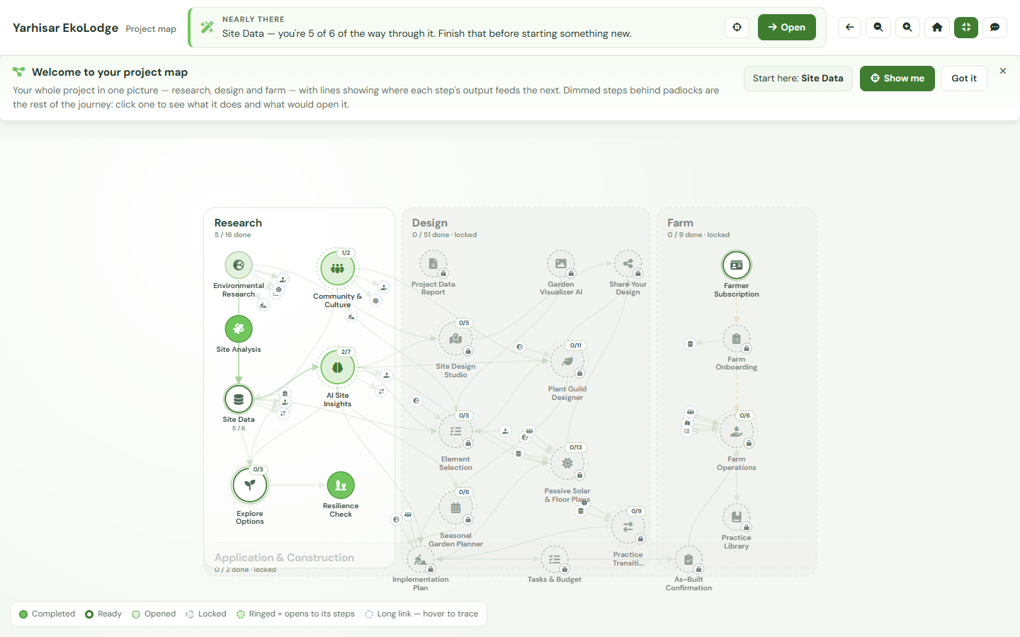
The map is divided into four labelled regions, in the order the work actually happens: Research (climate, soil, water, vegetation, community and the AI site insights built on them), Design (the site studio, element selection, the plant guild designer, the passive-solar floor plan pipeline, the seasonal planner), Application & Construction (implementation plan, tasks and budget, as-built confirmation) and Farm (the Farmer Hub steps, from farm profile through crop planning to records). Each region carries its own fraction of completed steps, or reads locked with the number of steps waiting inside it.
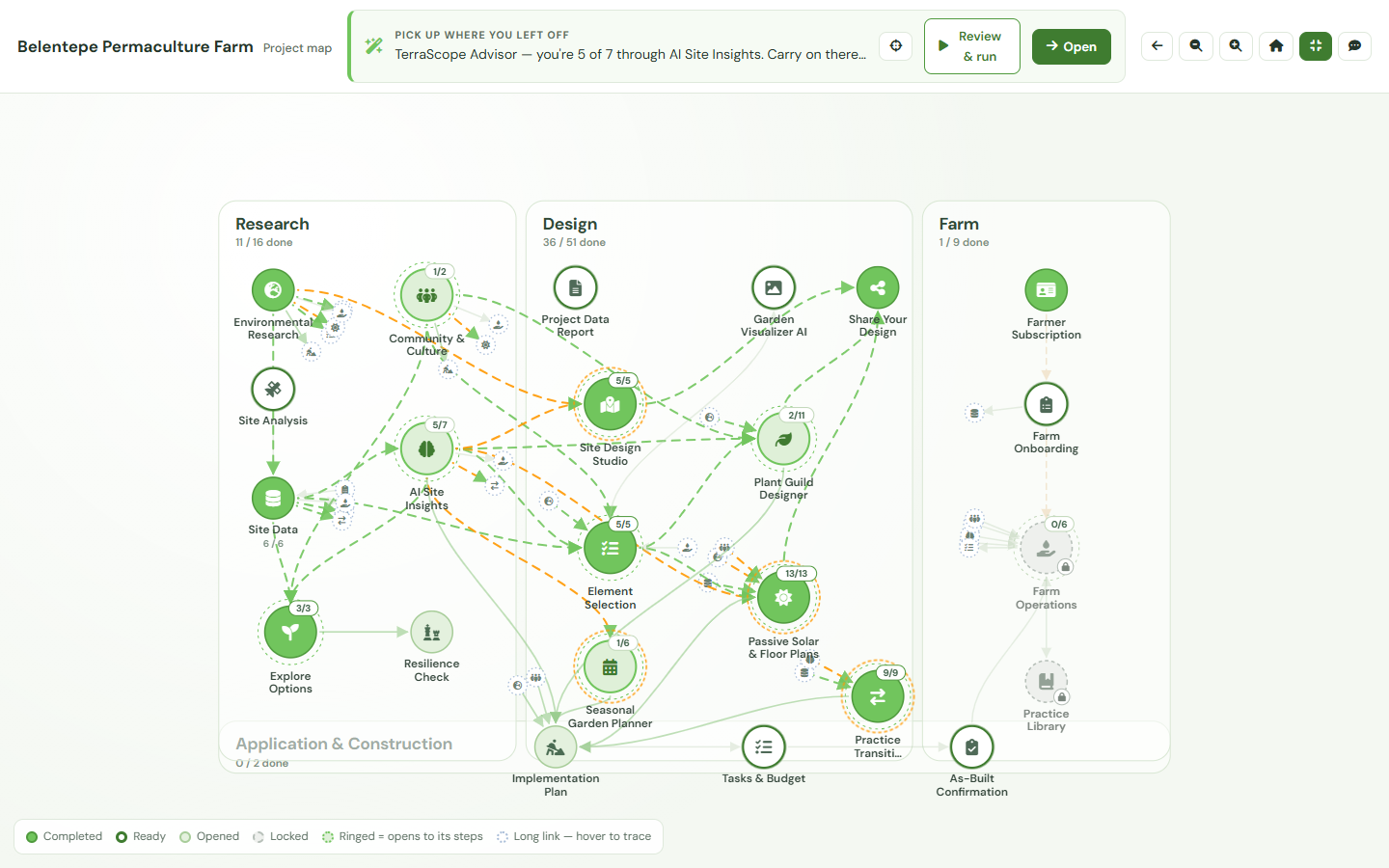
Each disc on the map is one step — some are tools you work in, some are AI agents that produce a report you read. The lines between the discs are not decoration. Each is a declared route by which one step's output feeds another: the soil and water findings that ground a sector recommendation, the site analysis a floor plan is oriented from. When this article was written the registry behind the map held 80 steps — 16 research, 52 design, 3 application and construction, 9 farm — and 109 declared feed connections between them.
Four words describe every step, and the same four appear in the map's legend:
- Completed — the step ran and its result is stored, with the date it completed.
- Ready — everything it needs has been done; nothing is in its way.
- Opened — you have been into the tool but it has not produced a stored result yet. This is the state that tells you where you left off.
- Locked — either an earlier step has to happen first, or the stage has not been unlocked for this project.
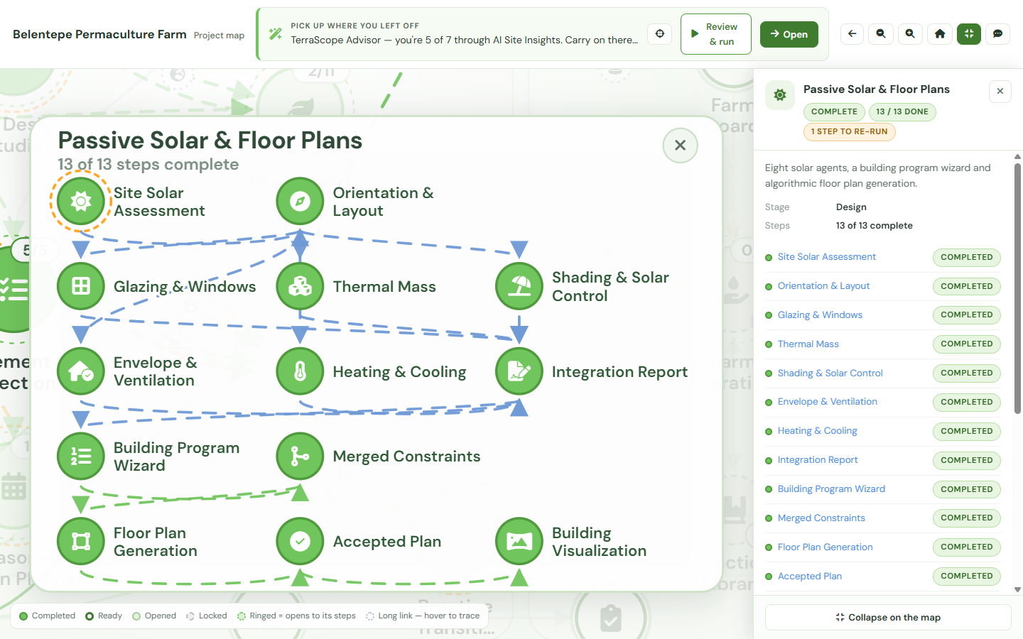
A disc drawn with a ring around it stands for several sub-steps and opens to show them. It expands in place: the neighbours dim, the children appear around the parent, and the map does not navigate anywhere, so you never lose your position or your zoom.
This article is the why and the what. If you want the controls — the toolbar, the legend, focus mode, what the first visit does — the Project Map help page walks through them.
Reading one step
Click any disc and a panel opens beside the map. For a completed step it carries the output that step actually produced — the AI's own text, its fields, and the timestamp — not a summary of it. That is the part that changes how the map gets used: it is not a progress display you glance at, it is where you go back to read old work. The finding you need in a client meeting is two clicks from the picture of the project, in the context of everything around it.
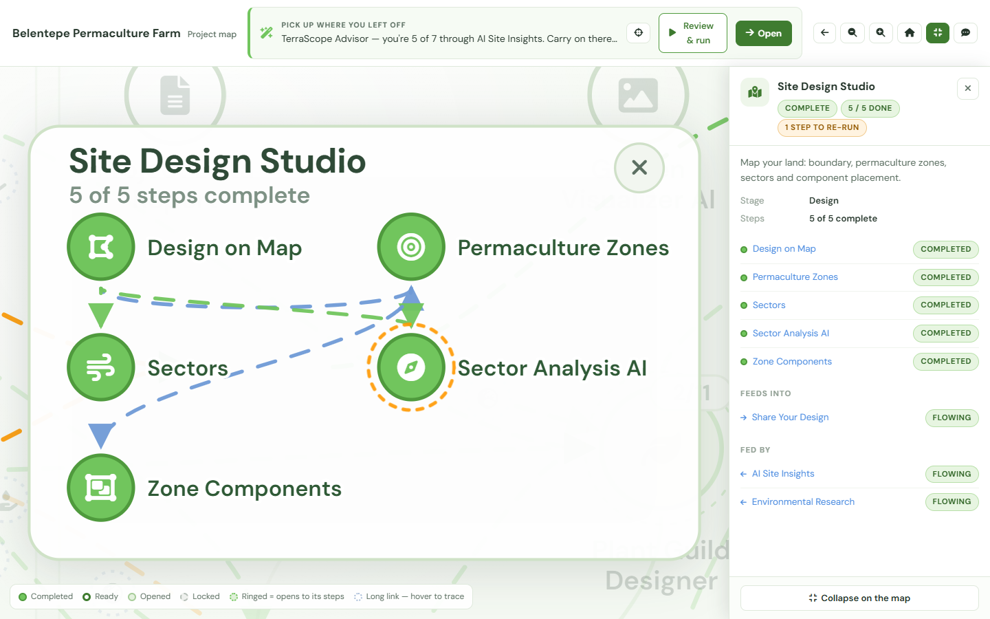
Below the output the panel splits the step's links in two: Feeds into and Fed by. Select one and the map names what travels along it — which findings ground which recommendation. This is what makes the map an audit trail rather than a diagram. You can walk backwards from a design recommendation to the soil and climate research underneath it, in front of somebody else, without opening a single file; and the same route works forwards, so before you re-run a piece of research you can see what depends on it.
The map is also candid about its own gaps. A step that ran before some of what it now reads existed says so in its panel, rather than presenting a stale result as current. For a step you have not done, the panel explains what it is for and what it needs. At the foot of either is Open, a deep link straight into that tool for this project.
What to do next, and why
Above the map sits a single recommendation. It names one step and — this is the part that matters — the reason it is being recommended. Sometimes the reason is momentum: this is what follows what you just finished. Sometimes an earlier result has gone stale on a clock and is due to be re-run. Sometimes the sequence simply says this comes next. And sometimes the most useful thing available is not a step at all but an unlock, in which case the banner says that instead of pretending otherwise. When every mapped step is done, it says that too.
A recommendation with its reason attached is a recommendation you can disagree with. The banner does not gate anything, and every other step on the map stays readable, so overruling it costs one click. That is the whole intent: not to decide for you, but to remove the pause where you have to reconstruct the state of a project before you can choose.
The first time you open a project map, a short strip appears above it — three sentences on what the picture is, why part of it is padlocked, and where to start, with a button that points the map at your first step. It is a strip rather than an overlay, so it never covers the map, and dismissing it gives the space back.
Ask the map
Some questions are faster asked than read. The project guide is a chat drawer about this project: why a step is recommended, what a locked step would give you, what a stored result means in plain language. It reads the same project state the map draws, so its answers are about your site and your work rather than about the software in general.
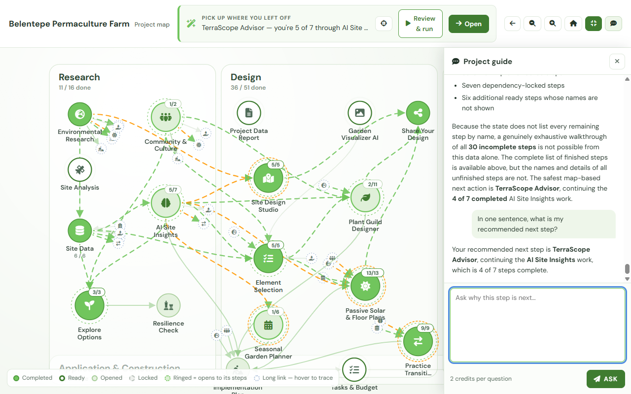
It is opt-in and it never speaks first. The price — 2 credits per question — is shown next to the box before you send, and a map you never ask anything never costs anything. The guide explains the recommendation; it does not make it. The ranking above the map is produced by rules, and the guide is deliberately not a replacement for them: it is a way to interrogate what the map already shows, not a second, differently-reasoned opinion sitting on top of it.
The map on a free project
A new project starts with Research open, and the rest of the road drawn. Design, Application & Construction and Farm appear in full — dimmed, padlocked, and clickable. You can open any one of those steps and read what it does, what it needs and what it would produce, before you have paid for anything.
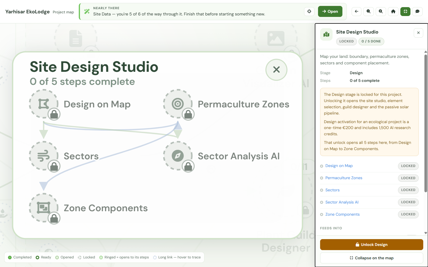
That is a deliberate choice about honesty rather than a marketing tactic. A tool that hides what you have not bought asks you to buy on trust; a map that draws it lets you judge the shape of the work first. Design is a one-time activation for a project rather than a subscription, and the Farm steps run on a hub for that project with a trial on your first one — the current figures live on the pricing page, and the map shows the app's own price for your project when you open a locked step. Work you did before a stage closed stays completed and keeps its stored output; the map names the closed gate rather than erasing the history behind it.
Where each stage is explained
The map is the view over the work. What the work itself is, stage by stage:
- Research — Know before you invest: how the Research Hub reveals a site's potential and risks, on what the research region produces and why it comes first.
- Design, the overview — The complete guide to permaculture design software in 2026, for how these tools fit together as a practice.
- Design, buildings — The passive solar floor plan generator, on how climate-responsive plans are actually generated.
- Design, planting — The plant guild design tool, from concept to polyculture.
- Farm — Why we built the Farmer Hub, on decision support for small-scale farmers.
- The thinking underneath — Designing for resilience, on why connections between the parts are the point.
Frequently asked questions
Is the Project Map free?
Yes. Every project has a map, including a free one, and the map is drawn whole from the first day — the stages you have not unlocked are included in the picture rather than hidden from it. Opening the map, reading any step, following its connections and reading what a locked step would do all cost nothing.
Does opening the map change my project?
No. The map is a view. It reads what your project already contains and draws it; it does not run a tool, rewrite a stored result or start anything on your behalf. Work happens when you open a step and do it. The only thing on the map that spends anything is the project guide, which is opt-in and priced before you send a question.
What does "Locked" mean on a step?
One of two things, and the step's panel always says which. Either an earlier step has to happen first — the map knows what feeds what, so it knows what is not ready yet — or the stage that step belongs to has not been unlocked for this project. A locked step is still readable: you can open its panel and find out what it does before deciding whether you want it.
What does the project guide cost?
2 credits per question, shown next to the box before you send. The guide is opt-in and never speaks first, so a map you never ask anything costs nothing. It explains the recommendation and the work already on the map; it does not replace the rules that produced the recommendation.
Does it work on a phone?
Yes. The map is responsive and is tested at 390 px wide — the toolbar stacks above it, the map stays pannable and zoomable, and a step's panel opens full width instead of beside the map. On a small screen the first-visit strip stands in for the recommendation banner so the two do not repeat each other.